The upcoming 0.9.9 version of the Profiler will partially expose the use of custom views. These views are used internally by the Profiler to create complex graphical UIs using short XML strings. While at the moment extensions can use PySide to create complex UIs, it’s better to avoid it if possible, since it involves an extra dependency and also because PySide might not be ported to Qt 5 in the future.
But let’s see a code snippet:
from Pro.UI import *

ctx = proContext()
v = ctx.createView(ProView.Type_Custom, "Debug Directory")
v.setup("<ui><vsplitter><table id='0'/><hex id='1'/></vsplitter></ui>")
ctx.addView(v)
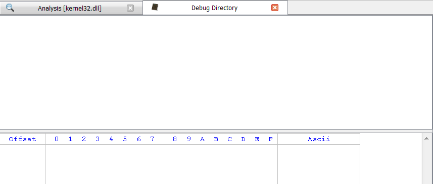
These few lines will display the following view:
Controls can be organized in layouts (hlayout/vlayout), splitters (hsplitter/vsplitter) and tabs (tab). These elements are called containers. Available controls are: label, pie, plot, table, tree, hex, text and media.
More controls will be available in the future and not all of the current ones can be used as it is. Some controls make sense only in combination with a callback to be notified about changes of the state of the control. The notification system will be made available to Python as well in the future, but it made sense to release a partial solution in the meantime, because many views don’t require notifications and only need a way to display information at the end of an operation.
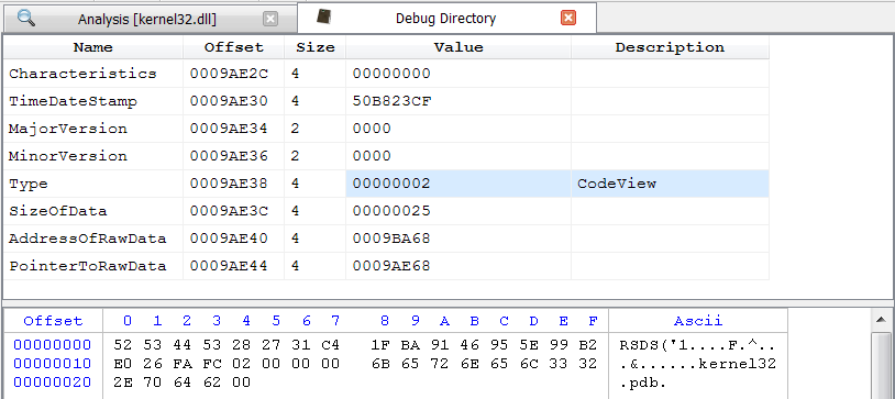
Let’s see for example how to make use of the UI above to display information.
This code replicates the Debug Directory UI in Portable Executables.
from Pro.UI import *

ctx = proContext()
obj = ctx.currentScanProvider().getObject()
dbgdir = obj.DebugDirectory().MakeSingle()
dbgdata = ctx.currentScanProvider().getObjectStream()
dbgdata.setRange(*obj.DebugDirectoryData(dbgdir))

v = ctx.createView(ProView.Type_Custom, "Debug Directory")
v.setup("<ui><vsplitter><table id='0'/><hex id='1'/></vsplitter></ui>")
v.getView(0).setStruct(dbgdir)
v.getView(1).setData(dbgdata)
ctx.addView(v)
Elements in a view can have attributes. We’ve only seen the id attribute used to identify the embedded controls. There are two kind of attributes: shared attributes and individual ones. Only controls have these shared attributes: width, height, min-width, max-width, fixed-width and fixed-height. If a c is prefixed to the width/height word, then the size can be expressed in characters. e.g.: fixed-cwidth=’10’. Additionally, since version 1.3, there’s also wfixed and hfixed. Both are booleans which, if true, set the fixed size policy.
Here’s a list of individual attributes for controls and containers.
- ui
- bgcolor (e.g. ffffff)
- hlayout/vlayout (hl/vl)
- margin
- spacing
- align (hcenter, vcenter, center, top, left, bottom, right)
- hsplitter/vsplitter (hs/vs)
- sizes/csizes (separated by -)
- tab
- index
- titles (separated by 😉
- label
- bgcolor (e.g. ffffff)
- select (bool)
- margin
- text
- readonly (bool)
- linenr (bool, show line number)
- hline (bool, highlight current line)
- hword (bool, highlight current word)
- wrap (bool)
- combo (since version 1.3)
- edit (bool)
- text (string, only if editable)
- btn (since version 1.3)
- text (string, only if editable)
- check (since version 1.3)
- checked (bool)
- text (string, only if editable)
- tline (text-line, since version 2.5)
While this post doesn’t present many usage examples, we’ll try to show additional ones in future posts.

